Project 09 · Brand + Web
VION
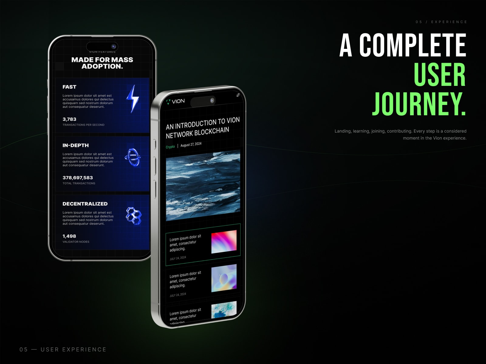
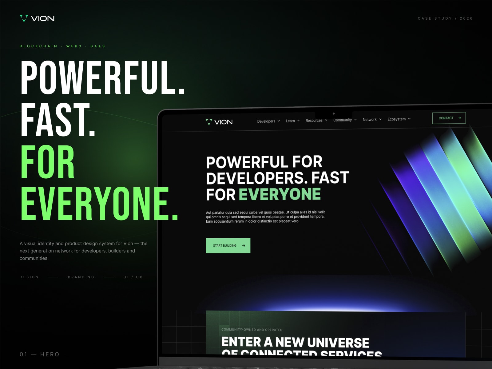
Blockchain is broken for people. VION is a brand and website built for mass adoption: powerful, fast, for everyone.
- Industry
- Web3
- Platform
- Brand + Web
- Type
- Identity + UI
- My role
- Product Designer
THEreceipts
What the work delivers.
- 01Tones: near-black palette, one signal green4
- 02Identity, UI and siteBRAND + WEB
- 03Designed for mass adoptionEVERYONE
the idea
BEFORE
THE PROBLEM
Blockchain still feels built for insiders (complex, slow and intimidating), so everyday people never get past the first screen.
and how we fixed it
AFTER
THE FIX
A confident brand system of deep near-blacks and a single electric signal green, plus a website that walks people through landing, learning, joining and contributing in clear steps.
MYrole
Lead Product Designer
I owned the product experience end to end, from shaping the flows with the founder and PM, through UI and the design system, to handoff and QA with the developers.
WORKED WITH
- Founder
- Product Manager
- Developers
- QA
KEYdecisions
The calls that shaped
the product.
- 01
One signal colour
Deep near-blacks with a single electric green make every important element impossible to miss.
- 02
Explain, then invite
The site moves visitors from landing to learning to joining to contributing, in that order.
- 03
Built for people, not insiders
Copy and visuals avoid jargon so blockchain feels approachable for everyone.
HOW ITcame together
01 · ALIGN
Shaped goals, users and scope with the founder and PM.
02 · MAP
User flows and wireframes for every key journey.
03 · DESIGN
High-fidelity UI and a reusable component system.
04 · SHIP
Dev handoff, review cycles and QA until it felt right.
THE GOODstuff